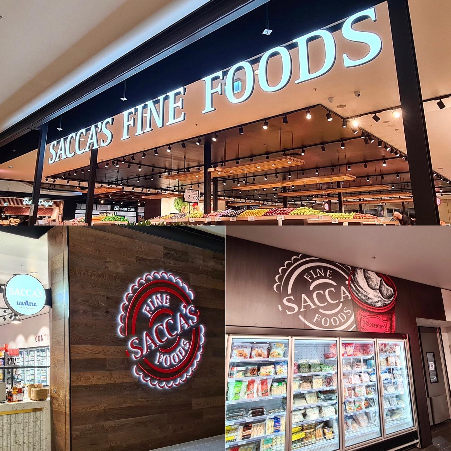
Your store’s signage reflects your brand and can directly impact sales. Approximately 76 percent of customers enter a store because of its signs, and roughly 68 percent of customers make purchases solely based on store signs. Here are a few pointers to ensure that your signage works for you rather than against you.
-
Have a plan:
Big windows take time to allow merchandising and marketing to collaborate and plan. Creating an event calendar can help you keep track of competitors, align with sales holidays, and save on shipping by ordering early.
-
Tell a story:
Nearly 80 percent of customers want brands to share a story. Retail signage can be achieved by linking individual merchant offerings under a theme related to their customers’ lifestyles. For example, it could be “Poolside Must-Haves” during the summer months and feature grab-and-go items, beverages, and snacks. By using store windows to tell a storey, retailers can engage customers in a unique, more memorable, limited-time opportunity.
-
Colors should be limited:
too many colors or patterns can distract customers or make it difficult to concentrate. Make sure that the colors contrast nicely with the copy. For example, it is best to present dark letters on a light background. Additionally, keeping the color palettes of your signs consistent makes it easier for customers to remember and recognize your store’s brand.
Keep store messaging visible from the road by keeping it at eye level. Look at the signage inside a passing car to determine the proper height. Again, it’s critical that the letters are in large, legible fonts that can be read from a distance.
-
Know your lighting conditions:
Signs with bright oranges, yellows, and other colors are challenging to read when placed in direct sunlight or under intense lighting. Also, keep in mind that if the store windows are tinted, the darker colors are harder to see.
-
Make your message unique:
To ensure that your message reaches customers, tailor your marketing by store. Make sure your marketing ideas are appropriate for your store’s location and customer demographics. To assist in creating hyper-local campaigns, consider using store intelligence technology.
-
Keep it simple and easy to read:
less is more. Your sign will be easier to see and read at a glance if your message is kept short. Because signs come in various shapes and sizes, make sure you select appropriately for the distance from which your sign or display will be seen. Think about where you’ll be and what obstacles might be in your way. The most crucial aspect of your signage is visibility.
-
Avoid clutter:
Effective signage communicates a message clearly and concisely. Your message must be conveyed to your target audience in as few words as possible. Having too many words or lines of text on your sign makes it more difficult to read from a distance.
“White space” is a design area uncovered by text or graphics (white space can be color). The space surrounding text and graphics is just as important as other design considerations. Unfortunately, there is a tendency to “fill” the available area with as much text as possible. But when the text is cluttered, it becomes harder to read. Therefore, thirty to forty percent of the front room of the sign should be left as blank space for optimal legibility.
-
Type and fonts:
Generally, clean, crisp, and easy-to-read style should be used for maximum readability. Most professional fonts have different weights, from regular to bold, black, extended, etc. Use them to your advantage by giving priority or preference to certain parts of your message.
There is a misconception that since ALL UPPERCASE LETTERS are “bigger” than lowercase letters, they must be easier to read from a distance. However, visual tests have concluded that uppercase and lowercase text is more readable from a distance than all uppercase letters. Since viewers may only have a few seconds to receive your message, increase the readability of your sign by avoiding excessive use of capital letters.
As a general rule, never use more than two different fonts in a single design. However, choosing two fonts that complement each other can make your message stand out. The most important thing is to use legible fonts when viewed from a distance.
Signage is a very affordable advertising medium. However, there is much more to indoor and outdoor signage design than meets the eye. Most people don’t realize that many questions and factors need to be considered before and during the design.
Getting a business together is hard enough. Proposing products, services, tasks, and team members requires thought, organization, and a good sense of the future outcome. However, advertising yourself can be even more complicated. In theory, signage, the most common form of advertising, is simple, but it can be challenging to find if you don’t know where to begin or what to look for.
Vinage Custom’s industry experts have been improving retail for many years now, from storefront signage to retail remodeling. To learn how we can assist you in creating a consistent, personalized brand experience, schedule a quick call with us today.