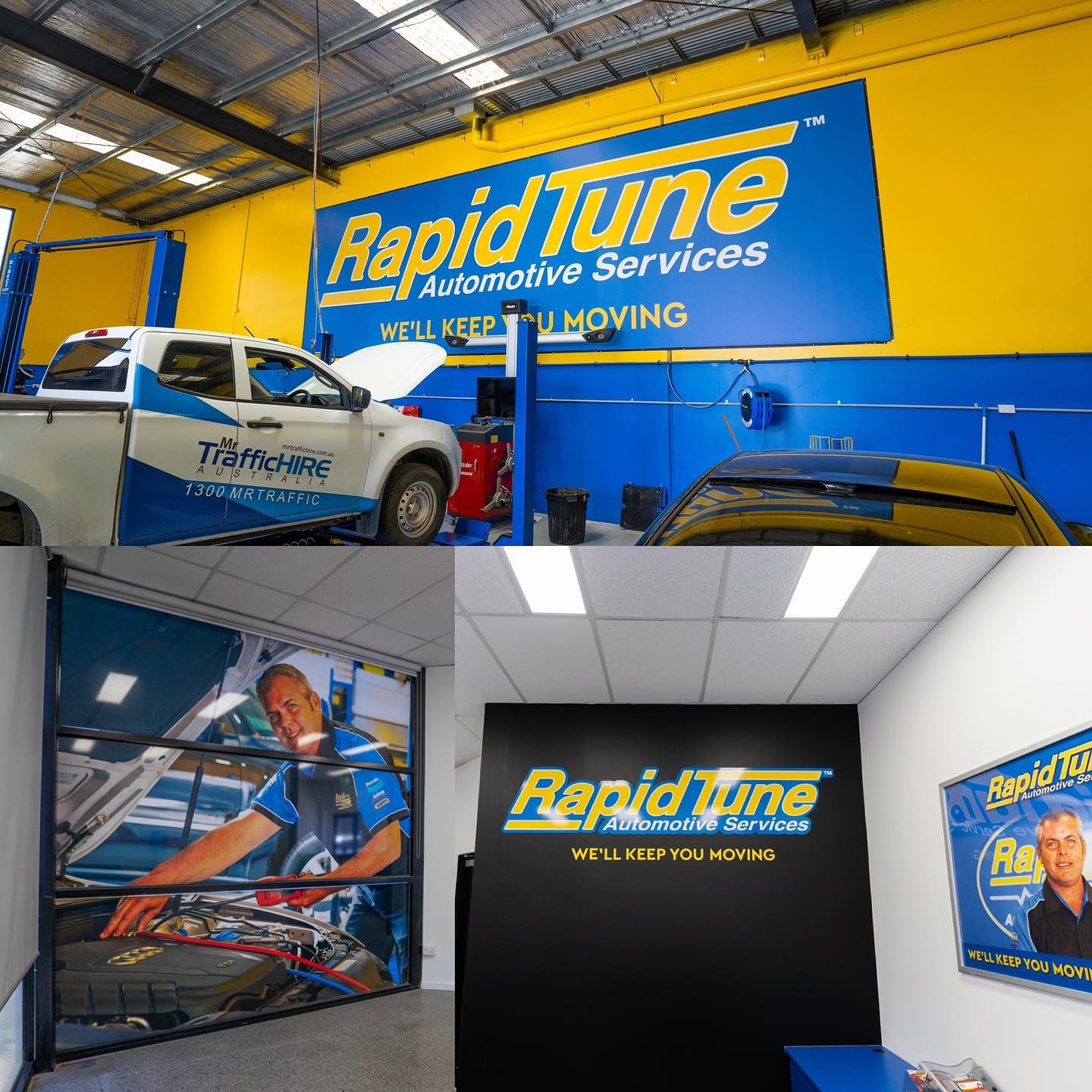
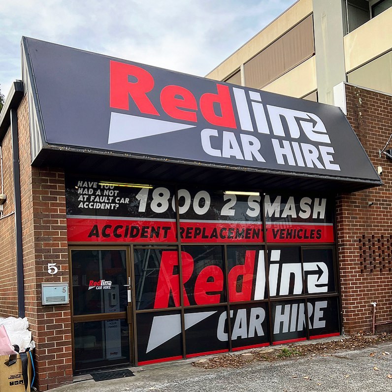
Effective signage is one of the most essential elements in a successful automotive repair shop. Your customers will often get their first impression of your shop from the outside; therefore, it’s crucial to make sure that they like what they see. Make sure to choose a sign that not only attracts your target audience, but also conveys professionalism, reliability, and trustworthiness—all qualities you want people to associate with your automotive shop! This article discusses how you can use signage as an effective advertising tool in your business and how you can easily get noticed with these four guaranteed ways to get noticed with automotive repair shop signage!

#1 – Don’t Rely on Signage
There’s no denying that automotive repair shop signage is essential. But if you’re relying solely on a sign out front, you’ll miss out on opportunities to get new customers in the door. Start by thinking about your target audience. What are their preferences and what do they care about? What are their pain points? Chances are, your auto body and car repair business has the answers to help them. When you create your signs or other marketing materials, remember these questions:
What does my potential customer want to see?
What does my potential customer want to know about us or our products/services?
What would my potential customer want from me after visiting our store or talking with me on the phone?
#2 – Use Contrasting Colors
To help your sign stand out, you can use contrasting colors. One of the best ways is to use light colors and dark colors. This is because the light colors pop against a dark background, and the dark colors pop against a light background. When deciding on what colors to use for your sign, there are some things that you need to keep in mind. You first need to choose between two different colors by asking yourself what color will be more visible. For example, if it’s going to be easier for your customer to see a red sign from 50 yards away, then it would make sense to make it red. Or if they’ll have an easier time seeing a green sign from 50 yards away, then you should go with green instead.
Another consideration when choosing between colors is the importance of contrast.
#3 – Use Big Letters
If you want people to notice your sign, make it big. You can use larger letters in the text on your sign or a bigger font size. The more noticeable your sign is, the more likely people will be able to see it from far away and take note of what they are seeing. Making it large also helps because you have less of an issue with glare, which means that the text on your sign is much easier to read. Finally, use bright colors: It doesn’t matter if you’re just doing black lettering on a white background – if there’s too much glare, no one will be able to read it. So make sure that you choose colors that contrast well against one another, so people can read your signs without having any difficulty whatsoever.

#4 – Think Outside the Box when you pick a signage
You may not think a sign is important, but it’s the first thing people see when they pull into your parking lot. Plus, if you have a better looking sign, you’ll make more money. There are endless possibilities for what you can do to make your signage stand out. You can go bold and bright or even add some humor with a funny sign.
Bonus: #5 – Make Sure Your Sign Is Visible
Nothing is worse than having a hidden sign. It should be in an area where customers can see it from their car window while driving down the road. If you want customers to know that there’s something at this place, then your sign needs to be seen by them as soon as possible so they know how close they are!
Conclusion
A business owner must stand out and make their storefront or business visible. The most common way to do this is through signage. You can go about getting your business noticed in many ways, such as using a logo, slogan, or photos of your work and location. Utilizing these tips will ensure that you create an eye-catching sign that will bring in plenty of new customers.


